Image Showcase
This post demonstrates how different images look with various positioning styles using our Tufte-inspired layout system. Thoughtful image placement can greatly enhance readability and visual appeal.
Mid-right positioning allows the text to flow naturally around the image while giving the visual slightly more prominence by extending into the margin. This creates an engaging layout that maintains readability while showcasing the image effectively.
Centered images work well for important visuals that deserve focus. They interrupt the text flow but create a natural pause for the reader to absorb the visual information. Use this positioning for your most significant visual content.
Aligning Images with Text Wrap
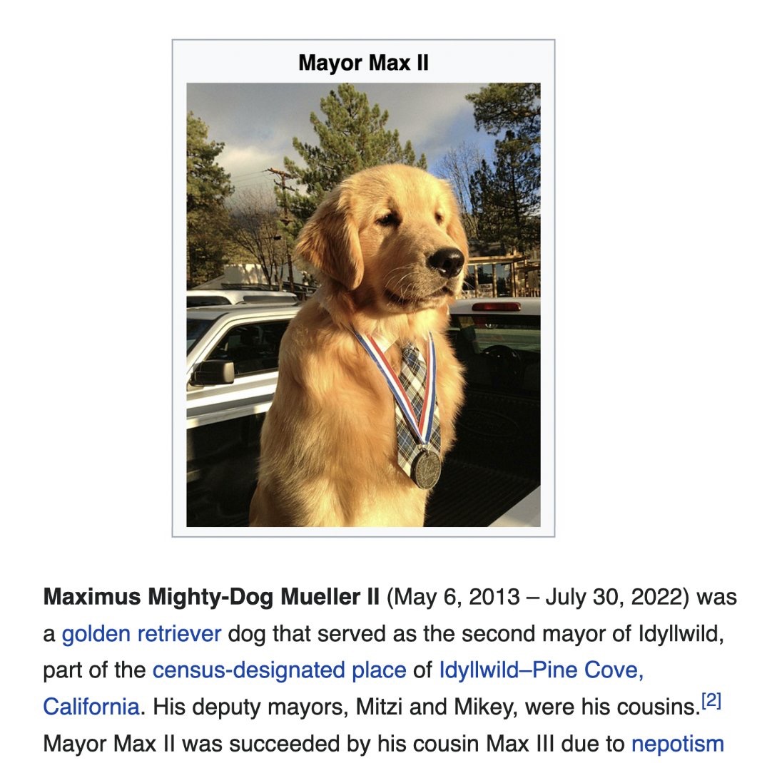
For images that support the text without needing to dominate, left or right alignment with text wrap is ideal. Left-aligned images, like Mayor Max II here, create a different rhythm in the layout compared to right alignment. The text wraps around the right side of the image, which can be used to create visual interest and variation in your post.
Using left alignment occasionally can prevent the monotony that might come from always positioning images in the same location. It's a subtle way to maintain reader engagement through layout variation.
Utilizing the Margin Space
Right-aligned images are a classic choice in web design, allowing text to flow naturally around the left side of the image. This traditional positioning creates a clean, readable layout that readers are very familiar with.
When using right alignment, the image sits flush with the right margin while text wraps around its left side, creating a balanced and harmonious composition.
Mid-Positioning for Impact and Flow
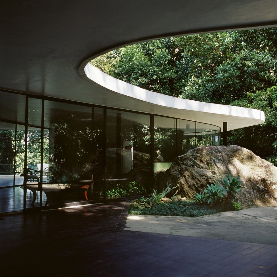
The mid-left and mid-right positions offer a compromise between in-text and margin positioning. They allow for larger images than standard left/right alignment while still enabling text wrap, by extending slightly into the margin. The mid-right interior shot here demonstrates how this creates space for the image without sacrificing readability.
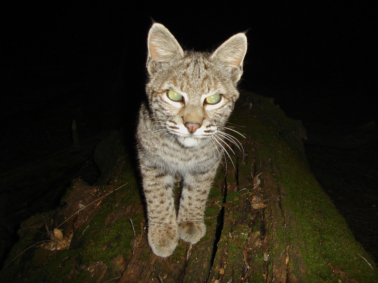
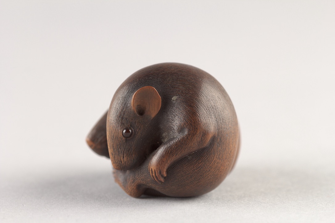
Similarly, the mid-left position provides more space for the image while text wraps on the right. Here, the cat image also uses the figure-shadow class for a touch of dimension, making it stand out slightly from the page.
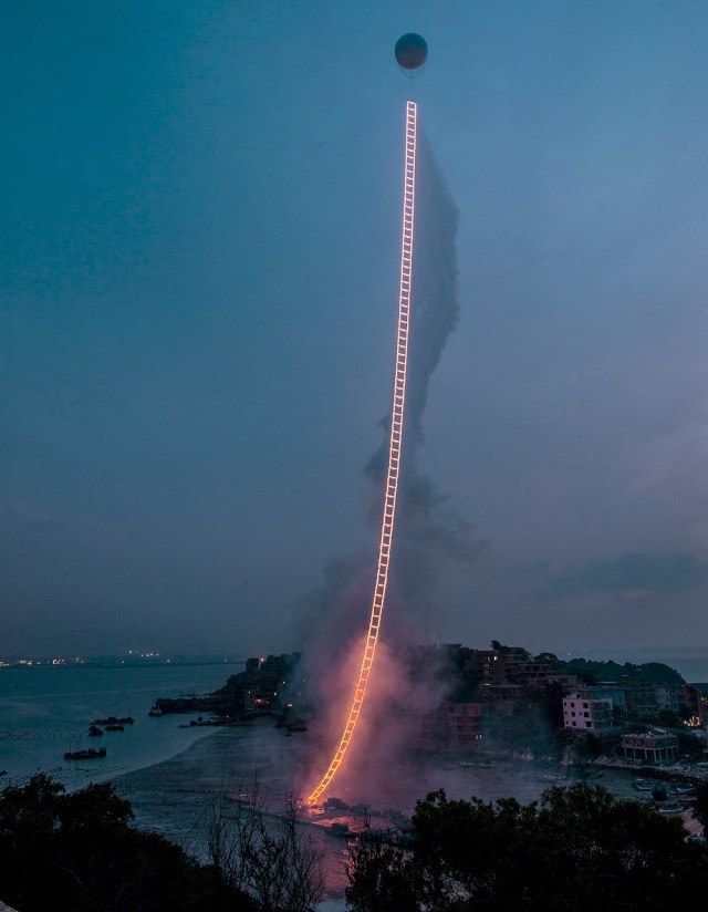
Full-Width for Maximum Emphasis

For truly impactful visuals, the full-width positioning spans the entire content area. Use this sparingly for images that deserve this level of attention and detail, like this abstract piece. Full-width images act as visual anchors, creating strong separation between sections or providing a powerful visual statement.